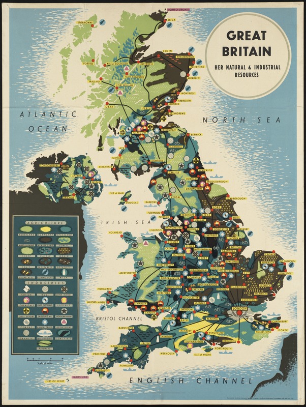
In the 1940's, the British Infornmation Services published the map, Great Britain--Her Natural and Industrial Resources. This map elegantly juxtaposes the island's landuse with different locations' industries. The cities then act as nexuses between the different regions, enabling trade and production. The visual connection allows one to understand the relationship between the agriculture and industry. How do people modify the landscape to for their needs?
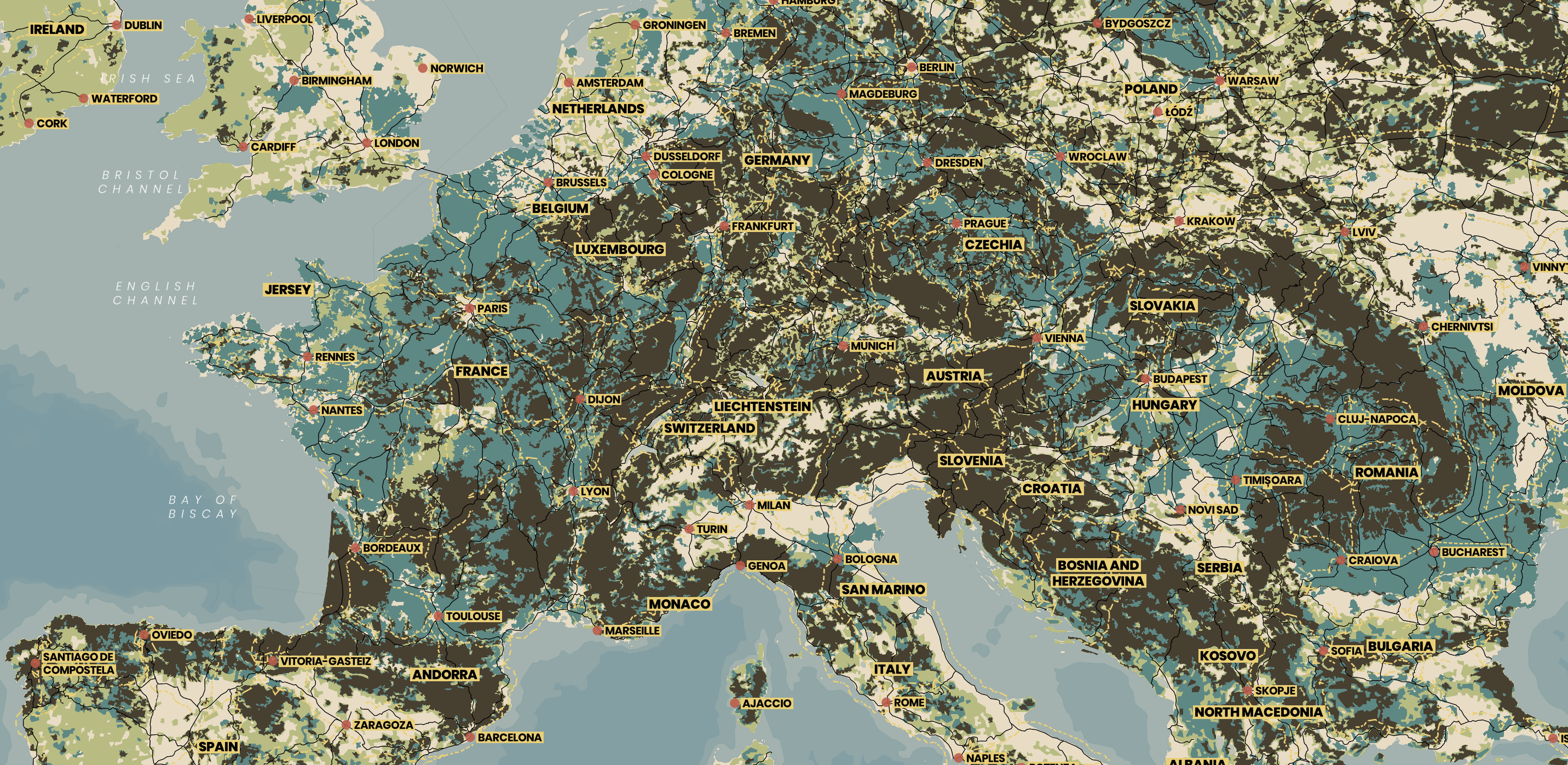
text-background, so the yellow bar behind the text is a bit of a workaround with maxed out text-halo. Because red, nor any other colour with a similar hue, is part of the map, the red circle explicity indicates quickly to readers where locations are without any confusion for cities with different name lengths.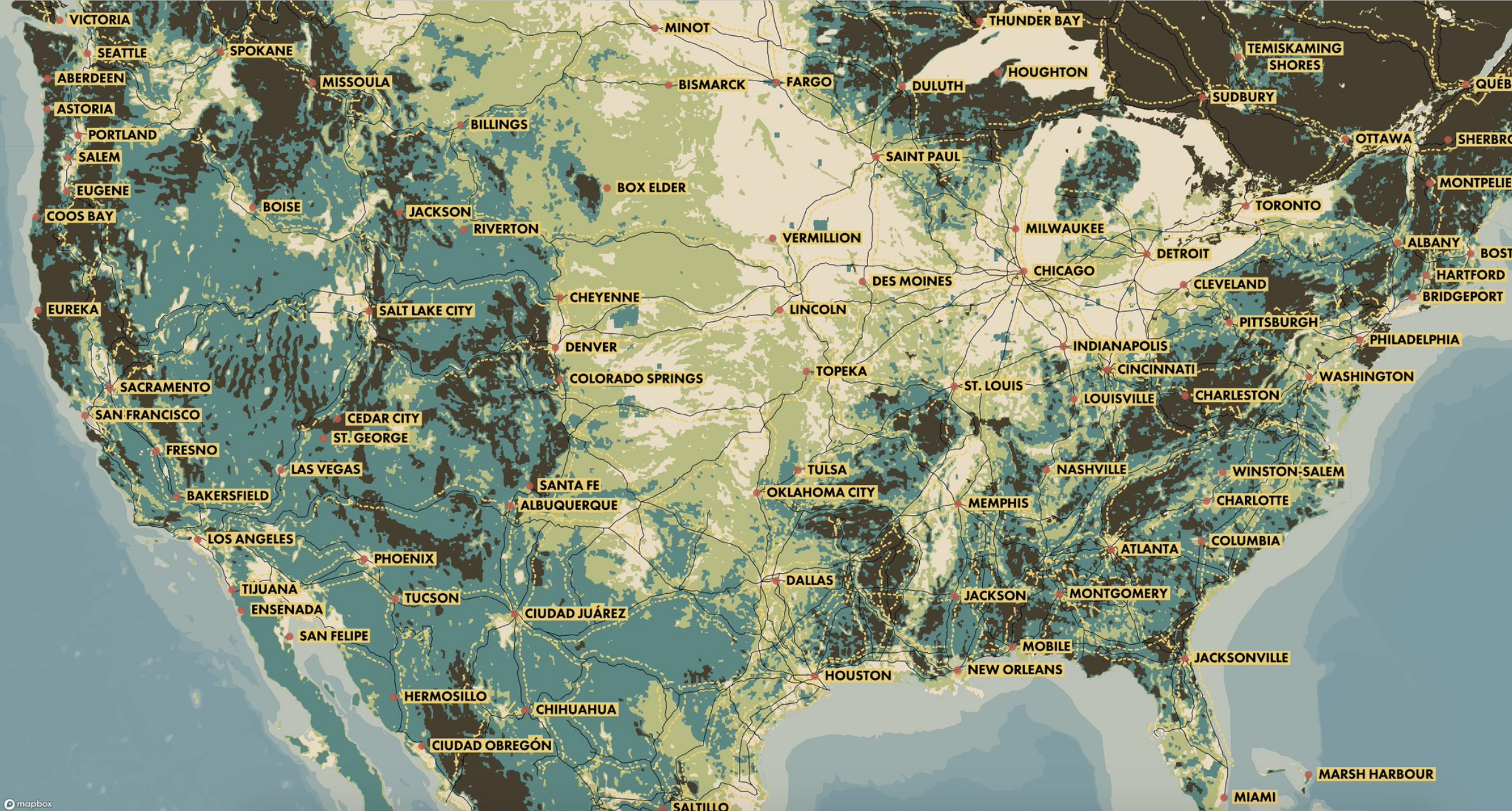
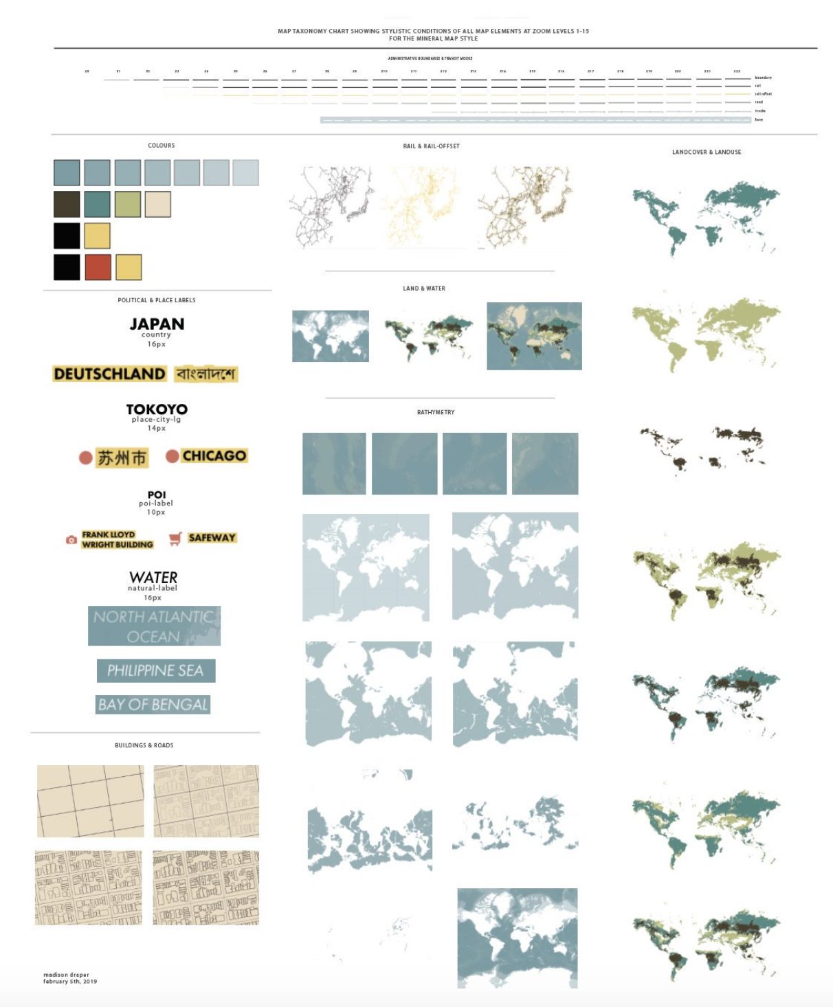
This taxonomy chart breaks down the map's elements and unmarries them from their geographic context. Here's a great post on taxonpmy charts for more about their purpose. This chart is a bit different though because I keep retain the geographic context, but remove it from the other geographic elements. I believe with all data, especially geographic, context is critical. So I kept some and examined each element individually.